Google’s latest Android Auto overhaul is not a subtle tune‑up, it is a wholesale rethink of how your phone and car share the dashboard. The update brings a cleaner layout, smarter suggestions and more glanceable information, but it also introduces design choices that can either streamline a commute or make a familiar drive feel strangely frustrating. After putting the new interface through its paces on real roads, I found a system that is more ambitious than ever, and also more polarizing, depending on how and where you drive.
The stakes are simple: Android Auto is no longer just a projection of your phone, it is positioning itself as a constantly evolving co‑pilot that wants to anticipate what you need before you reach for the screen. That ambition pays off in some thoughtful touches and sharper visuals, yet it also exposes the tension between flashy software ideas and the hard limits of in‑car ergonomics and safety.
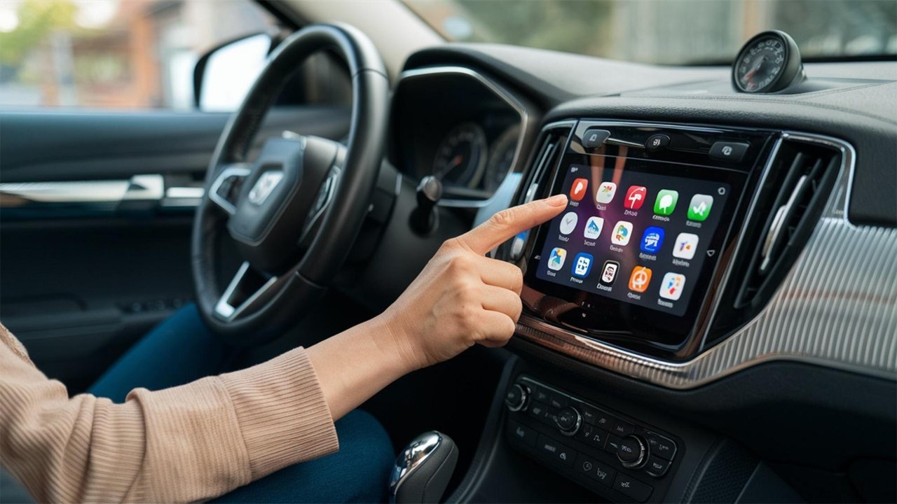
What actually changed in Android Auto’s biggest refresh
The most obvious shift in this release is visual. Android Auto now leans into a multi‑panel layout that keeps navigation, media and communication visible at the same time, instead of forcing you to live inside a single full‑screen app. The interface borrows heavily from the Coolwalk design language, with a persistent map tile, a secondary card for audio or calls and a narrow strip of app shortcuts that surfaces your most used tools. On a wide display in something like a recent Volkswagen Golf or Hyundai Ioniq 5, that means turn‑by‑turn directions, album art and message previews can coexist without constant app switching.
Underneath the new skin, Google is also pushing Android Auto toward what it calls a Glance experience, a Constantly Evolving Co Pilot that tries to surface the right control at the right moment instead of making you dig through menus. The goal is to let drivers access key smartphone features with fewer taps and less time spent staring at the screen, which is why the update leans so heavily on widgets, smarter suggestions and context‑aware cards that adapt to your route and habits, as detailed in the new Android Auto Glance Constantly Evolving Co Pilot push.
Coolwalk grows up: layout, widgets and multitasking on the road
Coolwalk started as a visual refresh, but in this update it finally feels like a functional philosophy. On my test drives, the split‑screen layout made it possible to keep Google Maps running while Spotify or Pocket Casts sat in a secondary pane, with a slim rail of app shortcuts along the side. That rail is not decorative: it learns which apps you actually use and keeps those icons within thumb’s reach, so jumping from navigation to a podcast or to a smart home control takes a single tap instead of a trip back to the home screen.
This evolution builds directly on Google’s 2022 Coolwalk design, which introduced app shortcuts and a split‑screen function that can show navigation alongside a media player, a pattern that is now central to the new release. The same design logic that once just rearranged tiles now underpins how Android Auto Google lets you see navigation, media and messages at the same time, a change that earlier Coolwalk coverage framed as a major advantage over more rigid layouts in rival systems like Apple CarPlay, as seen in both the Google Coolwalk rollout and the broader comparison of Android Auto Google Coolwalk against Apple’s approach.
On the highway: how the new interface feels at 70 mph
Out on a fast dual carriageway, the new Android Auto feels closest to what Google promised. With navigation pinned in the main pane and audio controls tucked into a secondary card, I could glance at the next turn, see the current track and skim an incoming message preview without hunting for anything. The larger touch targets and simplified typography help here, especially on factory screens that are not as sharp as a modern phone, and the system’s short and helpful smart replies make it easier than ever to stay connected without typing out full responses while driving.
That balance between information and restraint is exactly what Google’s own product page emphasizes, describing how Android Auto’s short and helpful smart replies are designed to keep drivers in the loop while minimizing distraction, and how the Connection and Smart home integrations extend that philosophy beyond messaging. In practice, that meant I could accept a suggested reply like “On my way” with a single tap, or quickly toggle a garage door scene, all within the same interface that Google promotes on its official Android Auto Read the Connection Smart hub.
City traffic and tight turns: where the redesign stumbles
The picture changes once you leave the motorway and dive into dense city streets. In heavy traffic, with frequent turns and short sight lines, the new centered map design in Android Auto 13.6 can feel more cluttered than the older, simpler layouts. The interface now layers more UI elements over the map, including cards and controls that sometimes obscure the exact lane guidance you are trying to follow, which is especially noticeable on smaller 7‑inch displays in older models from brands like Ford or Kia.
Those complaints are not hypothetical. Detailed user reports on the latest build describe how Navigation blocking has become a real problem, with Android Auto 13.6’s centered map design now obscuring routes with UI elements and making it harder to see upcoming turns at a glance. One breakdown of What changed in this version points to music controls that break decade‑old muscle memory and a layout that can require more taps than using the dashboard card, a criticism that echoes through the analysis of What Navigation Android Auto 13.6 and the related deep dive into why your car’s new interface might be ruining your drive, which specifically calls out how Navigation blocking undermines the promise of a safer, more intuitive experience.
How it compares with Apple CarPlay on real dashboards
Any major Android Auto update inevitably invites comparison with Apple CarPlay, especially in cars that support both. In a 2024 BMW 3 Series test vehicle, switching between the two systems highlighted how aggressively Google is pushing multitasking. Android Auto’s Coolwalk layout keeps navigation, media and communication visible together, while CarPlay still tends to prioritize a single app view, even if its own dashboard screen can show a limited mix of tiles. For drivers who live in Google’s ecosystem, that extra density can feel like a genuine upgrade.
That difference is reflected in broader evaluations that note how Android Auto Google has recently redesigned its interface to make it cleaner and more responsive, with the Coolwalk update allowing drivers to see navigation, media and messages at the same time. Those same comparisons often frame CarPlay as more visually consistent but less flexible, especially when it comes to showing multiple apps side by side, a gap that the latest Android Auto release tries to widen further, as highlighted in the assessment of Android Auto Google versus Apple CarPlay in 2025.
Voice, Assistant and the new “co‑pilot” behavior
Beyond the visuals, the biggest philosophical shift in this update is how aggressively Google leans on Assistant to keep your hands off the screen. In my drives, voice commands handled most of the heavy lifting: starting navigation to a saved home address, queuing up a specific Spotify playlist, dictating replies in WhatsApp and even adjusting some smart home devices on the way back. The system is clearly tuned to encourage speech over touch, with prompts that nudge you toward saying what you want instead of tapping through nested menus.
This is exactly the direction Google has been signaling, positioning Android Auto as a Glance friendly Constantly Evolving Co Pilot that uses widgets and a smarter assistant to reduce friction. The idea is that the system should anticipate when you might want to resume a podcast, suggest a coffee stop along your route or surface a calendar reminder without you having to think about it, a vision spelled out in the roadmap for Android Auto Glance and reinforced by Google’s own emphasis on short and helpful interactions in its official materials.
When the update goes wrong: bugs, regressions and driver backlash
No major software overhaul lands without friction, and this Android Auto release is no exception. Some drivers report that the new layout breaks long‑standing habits, especially around media controls that used to live in predictable corners of the screen. On older head units in cars like the 2017 Honda Civic or 2016 Mazda 3, the denser interface can feel cramped, with touch targets that are harder to hit on the move and animations that occasionally stutter when the phone is juggling navigation, streaming and background updates.
Those frustrations are captured in detailed critiques that argue your car’s New Android Auto Update Might Be Ruining Your Drive, pointing to music controls that break decade‑old muscle memory and interactions that sometimes require more steps than using the car’s own dashboard card. The same reporting notes that Android Auto has always been the scrappy underdog in the dashboard wars, which makes these regressions feel particularly sharp for loyal users who stuck with it through earlier growing pains, a sentiment that runs through the analysis of Why Your Car New Android Auto Update Might Be Ruining Your Drive and its focus on how design decisions can undermine real‑world usability.
How to get the new Android Auto (and what to do if you hate it)
For most people, the new Android Auto arrives as a silent update, but there are still a few levers you can pull if it has not shown up yet or if something breaks. On the phone side, the first step is to make sure the app itself is current, which means heading into the Google Play Store, tapping your profile icon, opening the Manage apps and device section and checking for pending updates. If you prefer to control timing, you can also turn off automatic updates and trigger them manually, following the same basic flow described in Google’s own Update Android Open the Google Play Store At the Tap Ma guidance.
If the new interface causes problems, the options are more limited. Android Auto is tightly integrated with the car’s own infotainment system, and as Google’s support forums make clear, You do not have any direct control over how the car manufacturer implements or updates it. The best you can usually do is confirm that both your phone and the car’s firmware are up to date, reboot the system and, in some cases, clear the Android Auto app’s cache or roll back to an earlier version if your device allows it, steps that echo the advice shared in the Android Auto You community thread where owners are reminded that manufacturers, not end users, ultimately control the in‑dash experience.
What carmakers and app developers can (and cannot) change
One of the more misunderstood aspects of Android Auto is who actually controls what. From the driver’s seat, it can feel like Google dictates everything, but in reality the carmaker, Google and app developers all share responsibility. Automakers decide how large the screen is, where physical buttons sit and how touch input is handled, which is why the same Android Auto interface can feel crisp in a 2025 Kia EV6 and cramped in a 2018 Toyota Corolla. App developers, meanwhile, are constrained by Google’s templates, which define how navigation, media and messaging apps are allowed to present information.
Those templates are not optional. A European legal document on Android Auto’s interoperability spells out how, in late 2018, templates were available for media and messaging apps and were later expanded to meet the needs of users of navigation apps like Google Maps and Waze, which are interoperable with Android Auto. That framework means a Spotify or WhatsApp developer cannot simply invent a new layout that ignores Google’s safety rules, and it also explains why navigation apps tend to look similar across brands, a reality captured in the description of how Waze and other services plug into the system in the official 62023CJ0233 ruling on templates and interoperability.
Behind the wheel: testing, impressions and what comes next
To see how all of this plays out beyond lab demos, I paid close attention to how reviewers and early adopters put the new Android Auto through its paces. In one detailed walkthrough, Brian in Detroit Michigan walks through Android Auto version changes from the driver’s seat, highlighting how the interface behaves in real traffic and how the system handles common tasks like launching navigation, managing calls and juggling multiple apps. That kind of hands‑on perspective, filmed from inside an actual car, underscores both the polish of the new layout and the rough edges that only appear once you are dealing with potholes, lane changes and spotty mobile data.
Those road tests line up with broader coverage that frames this as Google’s most significant Android Auto update yet and emphasizes that it has already been tested on the road in real vehicles. The consensus is that Google has given Android Auto its most significant update yet and that the new design, while not perfect, represents a clear step toward a more integrated, assistant‑driven driving experience, a view echoed in the on‑road impressions shared in the report that Nov Google Android Auto has been thoroughly tested in real‑world conditions and in the video tour where Mar Brian Detroit Michigan Android Auto walks viewers through what has been updated and how it behaves behind the wheel.
More from MorningOverview