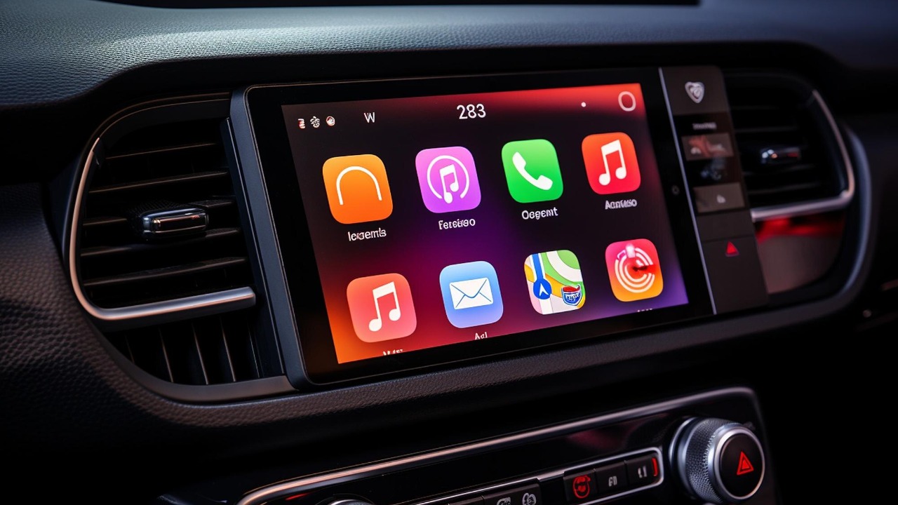
For more than a decade, carmakers treated giant touch panels as the quickest way to make any dashboard look futuristic. Now a growing list of brands is quietly reversing course, restoring rows of physical switches where glossy glass once dominated. The shift is not nostalgia, it is a response to safety data, driver frustration, and the realization that a car is not a smartphone on wheels.
I see a clear pattern emerging: regulators, crash testers, engineers, and drivers are converging on the same conclusion that tactile controls work better for the tasks people actually perform while driving. As automakers chase top safety ratings and try to keep customers loyal, they are discovering that the most advanced move in 2026 might be to bring back the humble button.
From futuristic showpiece to liability
Touchscreens spread through cabins because they were cheap to reconfigure, easy to market, and visually dramatic. A single panel could replace dozens of knobs, let designers draw sleek, uninterrupted surfaces, and give product planners the flexibility to add or rearrange features with software updates instead of new plastic tooling. As one analysis of major automakers put it, simple solutions like rotary dials and rocker switches were discarded in favor of on-screen sliders that looked advanced in brochures.
That design gamble is now colliding with the realities of driving. When climate control, audio volume, and even wiper settings are buried in layered menus, every adjustment demands eyes and attention that should be on the road. Safety organizations have started to treat this as a structural risk rather than a minor annoyance, warning that the same glossy surfaces that helped sell cars in the showroom can undermine the all important 5 star rating once vehicles reach the crash lab. The very feature that once symbolized progress has become a liability that manufacturers can no longer ignore.
Safety data is forcing a rethink
The most powerful pressure on in car touch interfaces is coming from safety research. Studies comparing reaction times show that interacting with a flat panel while driving significantly slows a driver’s response compared with reaching for a dedicated switch, especially when basic tasks like adjusting temperature or changing radio stations are nested inside multiple on screen steps. Legal analysts examining whether cars with touchscreens are more dangerous point out that, unlike physical buttons, flat panels offer no tactile feedback, so drivers must look away from the road to confirm every tap.
Crash testing bodies are also sharpening their stance. The director of NCAP, Matthew Avery, has called the overuse of touch interfaces an industry wide problem, arguing that key functions like indicators, wipers, and hazard lights should remain on stalks, buttons, or other traditional touch controls. In comments reported by one outlet, Avery told The Times that NCAP is prepared to penalize vehicles that force drivers into screens for essential operations, a warning that has already prompted some car brands to start rethinking touchscreens and bringing back physical buttons for core tasks.
Drivers are rebelling against “phone on wheels” design
Beyond the lab, drivers themselves are pushing back. Owners complain that simple actions like changing fan speed or defrosting a windshield now require hunting through icons that may be tiny, low contrast, or hidden behind multiple taps. In the US and Europe, research cited by The Auto Ind shows that many drivers cannot reliably perform basic in car operations on a screen without looking at the road for dangerously long stretches, a pattern that helps explain why some carmakers are ditching buttons and discovering what that choice has cost them in customer satisfaction.
Design leaders are starting to say out loud what many drivers have felt for years. Volkswagen design chief Andreas Mindt, speaking to Autocar and quoted in one report, put it bluntly, saying, “Honestly, it’s a car. It’s not a phone: it’s a car.” His remark came as one carmaker publicly committed to ditching touchscreen controls and replacing them with regular buttons, a move framed explicitly as an effort to respect how people actually use vehicles rather than how tech companies design apps.
Crash testers and insurers are turning up the heat
What began as scattered criticism is hardening into formal criteria. As NCAP and similar programs refine their scoring, they are looking not only at how a car performs in a collision but also at how its interface helps prevent one. Automakers that bury key controls in deep screen menus risk seeing their safety ratings clipped, a prospect that carries real commercial consequences in markets where buyers and fleets rely heavily on those stars. One detailed feature on how carmakers are embracing physical buttons again notes that reaction times using screens while driving are measurably worse, and that regulators are no longer willing to treat this as a mere design quirk.
Insurers are watching the same data. If a particular interface layout correlates with more rear end collisions or lane departure incidents, underwriters have every incentive to price that risk into premiums or pressure manufacturers to change course. That feedback loop is already visible in the way some brands talk about their next generation cabins, promising fewer layers of digital complexity and more direct access to safety critical functions. The message from the risk side of the industry is clear: a pretty screen is not worth higher claim rates.
Mercedes, MG and others quietly bring back buttons
Against that backdrop, some of the most aggressive touchscreen adopters are now leading the retreat. Mercedes has publicly acknowledged that its earlier pivot to capacitive touch surfaces went too far, and its software lead has said that internal data shows physical buttons are better, which is why the company is putting them back. A detailed breakdown of how buttons are coming back to cars quotes Mercedes Benz engineers explaining that, in part because of cost and complexity, they cannot simply bolt on a row of toggles or buttons overnight, but the direction of travel is set.
Other brands are making similar moves, sometimes with regional twists. MG, now a Chinese owned marque, never went fully all in on touchscreens, but it is still reshaping its cabins to emphasize analogue controls for core functions. A report on the car makers ditching touchscreens in favour of analogue controls notes that there are growing concerns that drivers distracted by in car screens can get other drivers banned if they cause serious incidents, a social and legal risk that is nudging even tech forward brands back toward tactile layouts.
Money, fashion and the slow pace of change
If the case for physical controls is so strong, the obvious question is why the transition back is taking so long. The answer, as one analysis framed it, comes down to “Money and Fashion.” It is expensive to put buttons in, not only because each switch requires its own wiring, testing, and assembly, but also because redesigning a dashboard to accommodate them means redoing molds, crash structures, and even airbag packaging. A detailed look at why it is taking automakers ages to put buttons back argues that the industry went down the touchscreen path partly because it seemed like the logical step in a fashion driven progression toward cleaner, more minimal interiors.
There is also a software inertia problem. Once a brand has invested in a proprietary infotainment platform, with teams of developers building features around a central display, it is hard to unwind that architecture. Moving functions back to hardware means rethinking not just the plastic parts but the entire user experience stack, from how climate control logic is coded to how steering wheel controls talk to the main computer. That is why even as manufacturers announce their intention to restore more tactile controls, they caution that the full shift will take multiple product cycles.
Regulators and brands recalibrate what “premium” means
For years, a big central screen signaled that a car was modern and, often, more expensive. Now regulators and brands are quietly redefining what counts as premium. Instead of sheer screen size, the focus is shifting to how quickly and safely a driver can perform the tasks that matter most, like setting a navigation destination, changing drive modes, or adjusting seat heating. In some markets, manufacturers are finally slamming brakes on touchscreens and capacitive touch buttons, with Mercedes among the top brands lining up to bring buttons back as a selling point rather than a concession.
This recalibration is changing showroom narratives. Sales staff who once boasted about how many functions had been moved into the display are now highlighting dedicated climate strips, physical volume knobs, and steering wheel buttons that control driver assistance without diving into menus. The message to buyers is that true luxury is not about mimicking a tablet, it is about reducing friction and distraction in everyday use. As more models adopt this philosophy, the market signal is likely to reinforce itself.
What the next generation cockpit will look like
The emerging consensus is not that screens will disappear, but that they will be used more selectively. Navigation maps, reversing cameras, and complex settings still benefit from a visual interface, and no one seriously expects those to revert to analogue gauges. The change is in how many essential functions are forced through that glass. Analysts who track major automakers say the new target is a hybrid cockpit, where a central display handles information rich tasks while a bank of physical switches covers the operations drivers use most often.
From my perspective, the most interesting experiments will be in how brands blend haptic feedback, voice control, and traditional hardware. Some will try to make touch panels feel more like buttons through localized vibration and raised textures, while others will double down on rotary controllers and stalks that can be operated entirely by feel. The common thread is a renewed respect for the cognitive load of driving. After a decade of chasing smartphone style minimalism, the industry is rediscovering that sometimes the safest interface is the one you can find with your eyes closed.
More from MorningOverview