Jaguar’s attempt to reinvent itself as a sleek, all-electric luxury brand is colliding with a mounting design backlash that now reaches from its logo to its leadership. What began as a bold aesthetic reset has hardened into a narrative of confusion, alienated loyalists and stalled momentum, leaving the company scrambling to steady its future product line and brand identity.
The ousting of its design chief, the collapse in key markets and the public rejection of its new visual language all point in the same direction: a storied marque that has misread both its heritage and its audience at the very moment it can least afford a misstep.
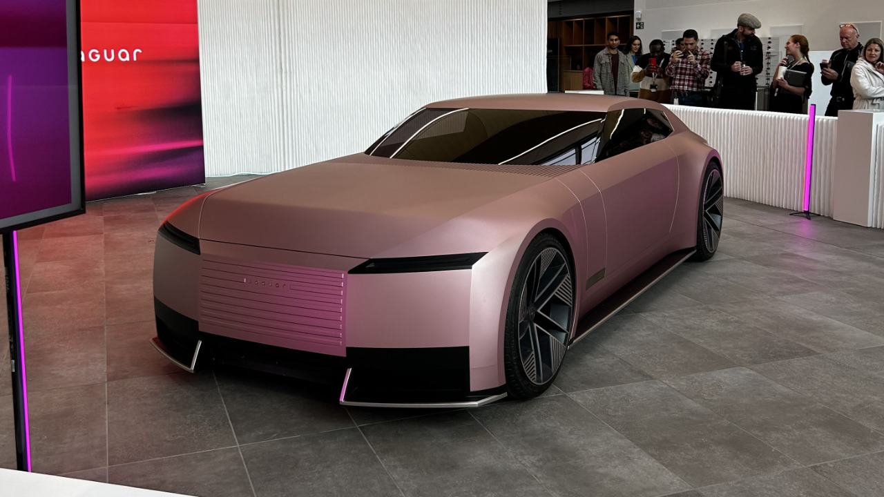
The rebrand that broke the spell
Jaguar’s recent overhaul was supposed to clear the decks for an electric future, yet the new visual identity has instead stripped away much of what made the brand instantly recognisable. Longstanding symbols and cues that once signalled British glamour and feline grace have been replaced by a pared back, digital friendly look that many enthusiasts see as generic. Critics argue that the redesign feels less like evolution and more like a hard reset that severs emotional ties built over decades.
Brand analysts note that the refreshed wordmark and iconography, introduced in Dec, were framed as a necessary step into a minimalist, screen led era, yet for many owners these changes read as a betrayal of the marque’s character. The new typeface and flattened cat motif are described as clinical and interchangeable, a far cry from the sculpted leaper that once adorned bonnets and brochures. Instead of signalling confidence, the redesign has become shorthand for a company unsure of what it wants to be.
From bold to bland: how the logo lost its bite
The most visible symbol of Jaguar’s identity crisis is its logo, which has been reworked into a stripped down mark that could belong to almost any premium brand. Where the old emblem carried a sense of motion and menace, the current treatment is so restrained that it risks disappearing in a sea of similar sans serif badges. For a company trying to justify premium pricing and a radical product pivot, that loss of distinctiveness is not a cosmetic issue, it is strategic.
Design commentators have described the new logo as Minimalist to the point of forgettable, arguing that it mimics a wave of generic luxury branding rather than leaning into Jaguar’s own story. The critique goes further, suggesting that the visual flattening mirrors a deeper uncertainty inside the company, with the badge now representing a brand that feels adrift rather than one confidently charting an electric future. In a market where Tesla, Porsche and others have carved out sharp visual identities, Jaguar’s new face risks fading into the background.
The advert that exposed the disconnect
If the logo signalled trouble, the much discussed brand advert made the disconnect impossible to ignore. The spot, which ran for just half a minute, focused on models in surreal, brightly coloured outfits and a high fashion aesthetic, yet conspicuously failed to show a single car. For a manufacturer fighting to convince buyers of its relevance in the electric age, the absence of any product felt less like confidence and more like avoidance.
The campaign, which arrived in Dec, quickly polarised opinion, with the 30 second film sparking a minute by minute frenzy on social media as viewers questioned why a carmaker would hide its own vehicles. The new design language showcased in the advert, from typography to colour palette, also split audiences, with some praising its boldness while others complained that even Gen Z viewers hated the tone. Instead of uniting old and new customers around a fresh vision, the campaign crystallised the sense that Jaguar was talking past both groups.
Public verdict: confusing, clinical and off brand
Beyond social media noise, structured research has reinforced the impression that Jaguar’s new identity is not landing with the public. Surveys of viewers exposed to the relaunch materials found that many people struggled to connect the visuals and messaging with the brand they thought they knew. Words like “confusing” and “clinical” surfaced repeatedly, suggesting that the attempt to appear futuristic had drained away warmth and personality.
Polling conducted in Nov found that while some respondents appreciated the visual polish of the new advert, many were perplexed by its lack of obvious connection to Jaguar’s history or product line. The updated wordmark and typography were seen as prioritising digital readability over distinctiveness, reinforcing the sense that the company had traded away its unique character for a generic tech aesthetic. For a brand that once sold emotion as much as engineering, that is a damaging verdict.
Dealers and “Jag man” left out in the cold
The design reset has not happened in isolation, it has coincided with a painful restructuring of Jaguar’s retail footprint that has left some of its most loyal customers feeling abandoned. As the company closes traditional dealerships and pivots toward a more selective, high end distribution model, long time buyers who identified with the old image of the marque are being told, implicitly, that they no longer fit the target profile. That shift might make sense on a spreadsheet, but it carries real reputational risk.
Reporting on the shake up describes how Jaguar has been accused of ditching the archetypal “Jag man” as it embarks on a dramatic brand overhaul, shuttering outlets and narrowing its focus to a smaller, more affluent clientele. For dealers and franchise partners, this has meant grappling with falling showroom traffic and a customer base that feels pushed aside just as the company asks for patience during its electric transition. The combination of a colder visual identity and a shrinking physical presence reinforces the perception that the brand is turning its back on its roots.
Sales slide and European alarm bells
The market response has been brutal, particularly in Europe, where Jaguar’s sales have slumped in the wake of the controversial rebrand. Retailers who once relied on a steady flow of executive saloons and performance SUVs now face empty showrooms and hesitant buyers. The design story is only one factor, but it has become a convenient shorthand for a broader loss of momentum.
Industry coverage of the downturn notes that For Jaguar dealers and franchise partners, the sales collapse has raised serious concerns about the brand’s market relevance, with many pointing to muddled messaging and stagnant showroom traffic as symptoms of a deeper problem. The shift to a more abstract, lifestyle driven identity has not yet translated into orders for current models, leaving retailers caught between the old range and a promised electric future that is still over the horizon. In that gap, rivals are picking off customers who might once have defaulted to a Jaguar badge.
Leadership turmoil and the “Barbie” relaunch in doubt
The most dramatic sign that Jaguar’s design gamble has gone wrong is the sudden removal of its creative figurehead. Chief Creative Officer Gerry McGovern, long associated with the styling direction of Jaguar and Land Rover, has been pushed out amid rising backlash over the radical new look and the polarising all electric Type 00 concept. His exit signals that senior leadership now sees the design strategy as a liability rather than an asset.
Reports on the shake up describe how Jaguar and Land Rover removed McGovern after major internal and public criticism of the new design identity, with concerns that his direction pushed too far from Jaguar’s heritage at a sensitive moment for the brand. Separate coverage of the fallout notes that the decision has thrown a planned “Barbie” themed relaunch into uncertainty, with James Warrington reporting that the ouster has cast doubt over the marketing push and the wider electric line up of cars. In that context, the figure 32 has become shorthand inside the company for the number of internal design and marketing initiatives now under review as leadership tries to regain control of the narrative.
A crisis years in the making
While the current storm feels sudden, the roots of Jaguar’s design and brand troubles stretch back years. Analysts who have tracked the company’s trajectory argue that the seeds were sown long before the latest advert or logo, in a pattern of inconsistent product planning and shifting positioning. The company has oscillated between chasing German rivals on technology, leaning into British heritage and flirting with avant garde styling, without fully committing to any one path.
One detailed post mortem on the brand’s trajectory, published in Aug, notes that But that is enough to establish a narrative in the minds of many, as Headlines swirled that Jaguar sales across key regions were faltering even before the latest rebrand. The analysis traces the story back to a pivotal moment in November, when internal strategy debates over electrification, model line ups and pricing began to spill into public view. By the time the new visual identity arrived, the brand was already on shaky ground, making the backlash more intense and the leadership response more urgent.
Heritage ignored, roots forgotten
At the heart of the criticism is a simple charge: Jaguar has forgotten what made it special. For decades, the brand traded on a blend of British eccentricity, racing pedigree and louche charm that set it apart from more clinical German rivals. The current rebrand, by contrast, seems determined to scrub away those idiosyncrasies in favour of a smooth, international luxury language that could belong to any number of high end marques.
Marketing experts have argued that the company should, in their words, Always go back to its roots and cultural heritage, warning that brands which ignore their own stories risk going bland, like Jaguar. They point out that the omission of classic cues from the relaunch video, from the leaper to evocative shots of iconic models, sent a clear signal that the company was more interested in chasing trends than honouring its past. That choice may have impressed some design consultants, but it has left many long time fans wondering what, if anything, still makes a Jaguar a Jaguar.
Electric pause and a high stakes reset
Compounding the design turmoil is a radical commercial decision: Jaguar will pause new car sales for an extended period as it prepares its next generation of electric models. The move is intended to clear inventory and create a clean break before the arrival of a fully electric line up, but it also leaves the brand with little to sell while it tries to repair its image. In a fiercely competitive market, voluntarily stepping back from the showroom floor is a high risk play.
Leasing and fleet specialists have highlighted that However, Jaguar (Jaguar models) remains committed to an all electric future, arguing that the brand’s repositioning will ultimately make it a more compelling option in the high end market. That optimism rests on the assumption that the company can use the pause to refine its design language, reconnect with its heritage and present a clearer story to customers when the new cars arrive. If it fails to do so, the hiatus will look less like a strategic reset and more like a retreat.
Design crisis turns existential
The cumulative effect of these missteps is that Jaguar’s design debate has become an existential question about what the brand stands for. The ousting of Gerry, the uncertainty around the “Barbie” relaunch and the backlash to the advert and logo have all fed into a broader sense that the company is improvising its way through a critical transition. For a marque that once projected effortless confidence, the impression of internal turmoil is itself damaging.
Coverage of the unfolding saga notes that the situation has gone from bad to worse, with Jaguar now facing questions not just about styling but about the coherence of its entire strategy. When you buy through links on articles dissecting the crisis, you are reminded that Future and its syndication partners are chronicling a brand at a crossroads, while JLR’s parent company, Tata Motors, weighs how far to roll back or revise the current direction. The next wave of electric models will not just test Jaguar’s engineering, they will test whether the company has learned from a design experiment that went badly off course.
More from MorningOverview